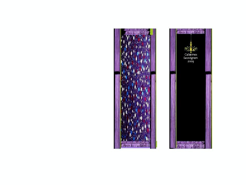
France has an excellent reputation for being the world’s greatest producers of wine, so I've decided to choose France as my produce. The French wine industry has been trying to reinvent itself from 2003, producing new wines for the fast and growing changing world and also the European market, while continuing with their original wines. I think that my new and upcoming wine brand Silhouetta is just what the wine growing industry of France needs , to revitalize and reinvent its reputation to a higher standard once again. Cabernet Sauvignon Silhouette produce of France 2009 made in the Bordeaux region of France is one of the world’s finest red wines, Cabernet Sauvignon a dominant grape has spread to every other major growing region notoriously making its reputation soar. The target market that I am aiming to attract is between 25-35, Silheutta is a very elegant red wine made with perseverance and class it will be the no:1 red wine to have. It’s amazing texture and fruitiness is so delicious that it will intensify your taste bud’s. The flavourings of the wine are crisp and fruity, and is suitable for drinking on its own, but would also pair well with red meat or dishes with a heavy butter cream sauce.
My final result

The visual presentation of Silhouetta is eye catching but also very simplistic, going by the colours it’s a very female label which may attract female, but in the making of this label it was not my intentions.lol Basically I wanted to create a label that would stand out, and I think I can tick that box, also my choice in type and font size also goes well with the final label. Over all I’m quite pleased with my outcome. Red wine is my choice always , if I was to walk into a wine mark now and choose my red wine I would definitely be intrigued to try Silhouetta. £12.00 a pop for a 5 star elegant bottle of wine isn’t bad at all I must admit. Its the resession i no, but sure one sip of Silhouetta and you'll be delerious with how GOOD it is ..SERIOUSLY
Type Face: Cabernet Sauvignon/ Baskerville
The rest of the text on bottle I used Casablanca Light
Label Design inspiration came from my research on wine labels, Caelum wine collection is Silhouette style also a very simple design, but it works so good, that was the style i was aiming for. The creative process was to snap a few photos of skylines, buildings houses etc, manipulated the picture to get my desired result with photoshop basically adjusting the colour and adjusting the exposure, used illustrator for Txt and few extra bits. I was very happy with my outcome. Enjoyed the research and the developent.
Wine packaging :

The chandelier is the symbol I will use for all collections of Silhouetta. The chandelier for me represents elegance and class and maturity due to its era. Chandeliers were made around Medieval periods, usually located in palaces, places of royality and for the use of extremely wealthy people.
Silhouetta to me shouts out just this elegance and class, and for me this symbols works well.

Feast your eyes on this :

No comments:
Post a Comment